

dunnhumby Consumer Data: Customer Segmentation
Introduction
In my last post, we did some exploratory data analysis on a dataset of household level transactional data from dunnhumby. We looked into patterns within the data with regard to revenue, new customers, and retention.
Now that we have become familiar with the structure and contents of the data that we will be working with, it’s time to start building things.
The first thing that we will tackle is customer segmentation.
Customer Segmentation
Customer segmentation is the process of grouping customers into uniquely defined groups to more effectively deliver specific needs.
For example, before customer level transactional data was collected, a supermarket would send the same Coca-Cola coupon to every customer. However, not every customer drinks, let alone buys, soda. Now that supermarkets collect transactional data showing the products that each customer is buying, companies can group customers into segments that reflect buying patterns and send out coupons that are tailored to each segment.
Sending coupons that are specific to each customer increases the chances of the coupon being redeemed and gets more people into the store.
There are many different applications when it comes to segmentation. Customers can be grouped in segments of similar buying patterns, risk to churn, retention rates, cross-selling potential, and much more.
For the purposes of this project, we are interested in customer loyalty. The easiest way to measure loyalty is with RFV (recency, frequency, and value). The loyalty of a customer can be measured based on a mix of these three metrics.
Analysis
Recency
The first component of our customer loyalty segments will be recency. Recency looks at when a customer last made a purchase. It serves as an important measure because a declining recency can be a signal of a customer soon to take his or her business elsewhere.
Let’s take a look at the distribution of recency in our dataset.
# recency
max_day <- max(transaction_data$DAY)

recency_table <- transaction_data %>%
  group_by(household_key) %>%
  summarise(MaxPurchaseDate = max(DAY),
            Recency = max_day - max(DAY))

# recency plot
ggplot(data=recency_table, aes(x=Recency)) +
  geom_histogram(fill = "orange", color = "black", binwidth = 7) +
  scale_x_continuous(breaks = seq(0,1000,50)) +
  labs(title = "Customer Recency", x = "Days Since Last Visit", y = "Count") +
  theme(plot.title = element_text(hjust = 0.5, size = 24),
        axis.title = element_text(size = 20),
        axis.text = element_text(size = 14))
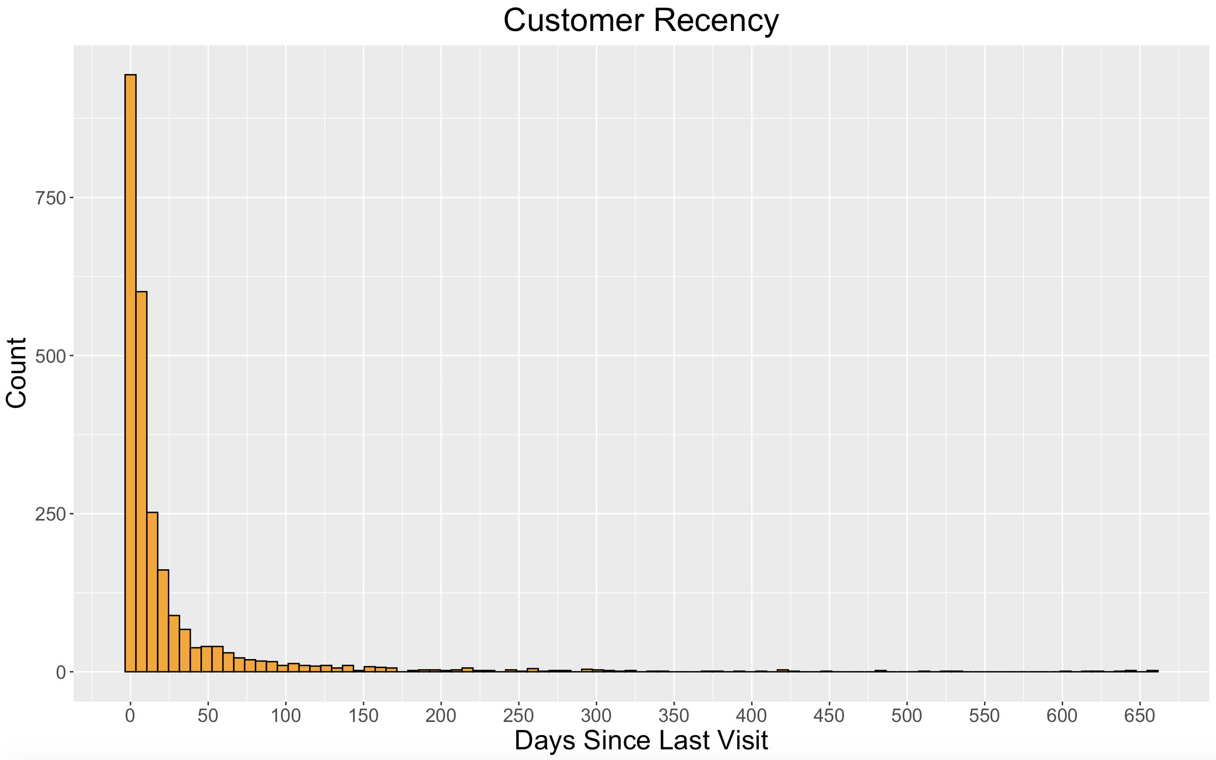
Each bar in the histogram above represents one week. We can see that nearly 1000 of our 2500 customers in our dataset made a purchase within the last week, and around 1600 customers made a purchase within the last two weeks.
Next, I want to put our customers into groups based on their recency. To do this, we will use k-means clustering with our number of clusters being 4. (The elbow method showed to use 4 clusters, but 4 was also selected for practical purposes.)
# kmeans cluster into 4 groups
set.seed(1234)
recency_k <- kmeans(recency_table$Recency, centers = 4)
recency_table$Cluster <- recency_k$cluster
recency_table$Score <- ifelse(recency_table$Cluster==2,1,
                              ifelse(recency_table$Cluster==3,2,
                                     ifelse(recency_table$Cluster==4,3,4)))
The clusters will be used as a “Recency Score” with higher scores being more valuable. Customers in the group with the lowest recency will receive a score of 4, and customers in the group with the highest recency will receive a score of 1.
But, recency alone with not paint the full picture of a customer’s loyalty.
Frequency
The second component of our customer loyalty segments will be frequency. We want to know how often each customer is making a purchase because more purchases typically mean more money.
Here’s a look at the distribution of customer frequency.
# frequency
frequency_table <- transaction_data %>%
  group_by(household_key) %>%
  summarise(Frequency = length(unique(BASKET_ID)))

# frequency plot
ggplot(data=frequency_table, aes(x=Frequency)) +
  geom_histogram(fill = "orange", color = "black", binwidth = 25) +
  scale_x_continuous(breaks = seq(0,2000,100)) +
  labs(title = "Customer Frequency", x = "Visits", y = "Count") +
  theme(plot.title = element_text(hjust = 0.5, size = 24),
        axis.title = element_text(size = 20),
        axis.text = element_text(size = 14))
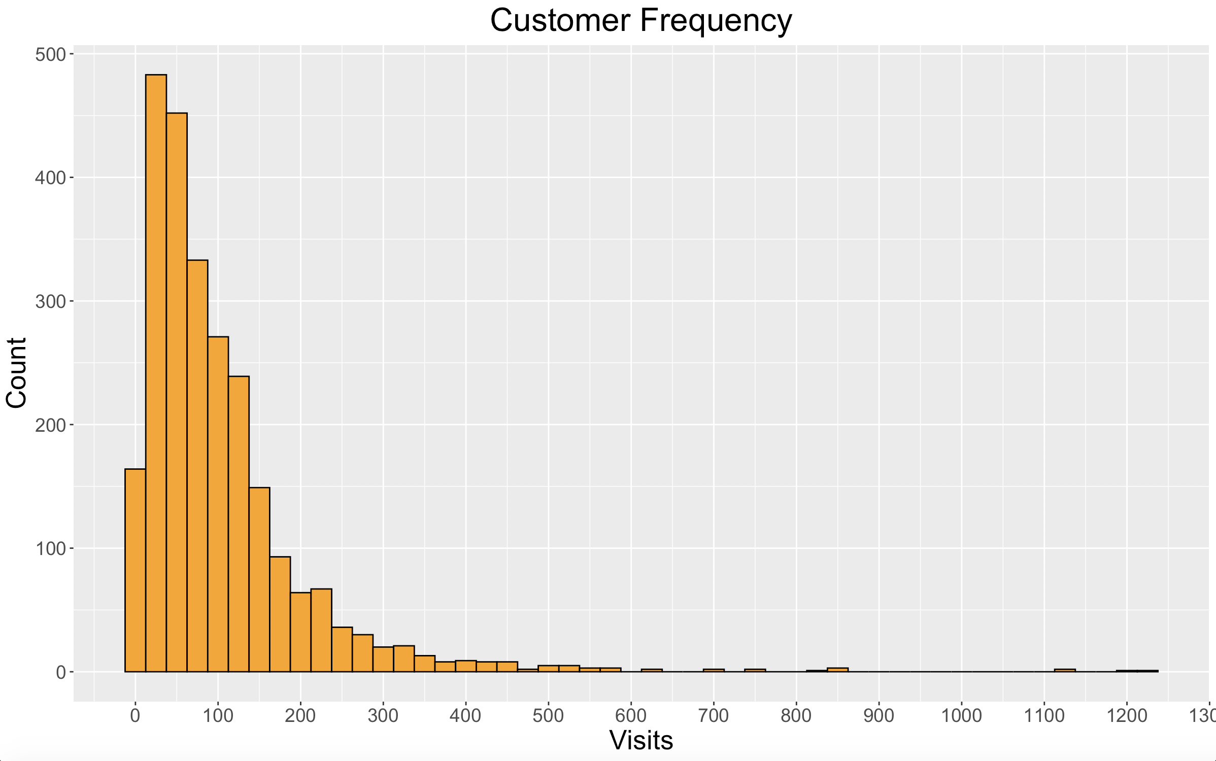
Looking at the plot we can see that frequency peaks between 25 and 50 purchases. Our dataset spans 102 weeks, so on average these customers would have made a purchase every 2-4 weeks. However, we can also see that there are many customers who made purchases even more frequently.
We will cluster our customers based on frequency just like we did with recency, using k-means with 4 clusters. Again, we will use these clusters as a “Frequency Score” with higher scores being more valuable and being awarded to more frequent shoppers.
# kmeans cluster into 4 groups
set.seed(1234)
frequency_k <- kmeans(frequency_table$Frequency, centers = 4)
frequency_table$Cluster <- frequency_k$cluster
frequency_table$Score <- ifelse(frequency_table$Cluster==2,1,
                                ifelse(frequency_table$Cluster==3,2,
                                       ifelse(frequency_table$Cluster==4,3,4)))
Now that each customer has a Recency Score and a Frequency Score, we have one metric left to factor into our customer loyalty segments.
Value
The final component to our customer loyalty segments is value. This not only looks at how profitable each customer is to the business, but also shows how much value a customer perceives in the brand. If customer value decreases, it means that the customer is finding value and spending money elsewhere.
Since cost is not provided in our dataset, we will use revenue to measure customer value rather than profit.
Let’s take a look at the distribution of customer revenue.
# revenue
revenue_table <- transaction_data %>%
  group_by(household_key) %>%
  summarise(Revenue = sum(REVENUE))

# revenue plot
ggplot(data=revenue_table, aes(x=Revenue)) +
  geom_histogram(fill = "orange", color = "black", binwidth = 1000) +
  scale_x_continuous(breaks = seq(0,40000,5000)) +
  labs(title = "Customer Revenue", x = "Revenue", y = "Count") +
  theme(plot.title = element_text(hjust = 0.5, size = 24),
        axis.title = element_text(size = 20),
        axis.text = element_text(size = 14))
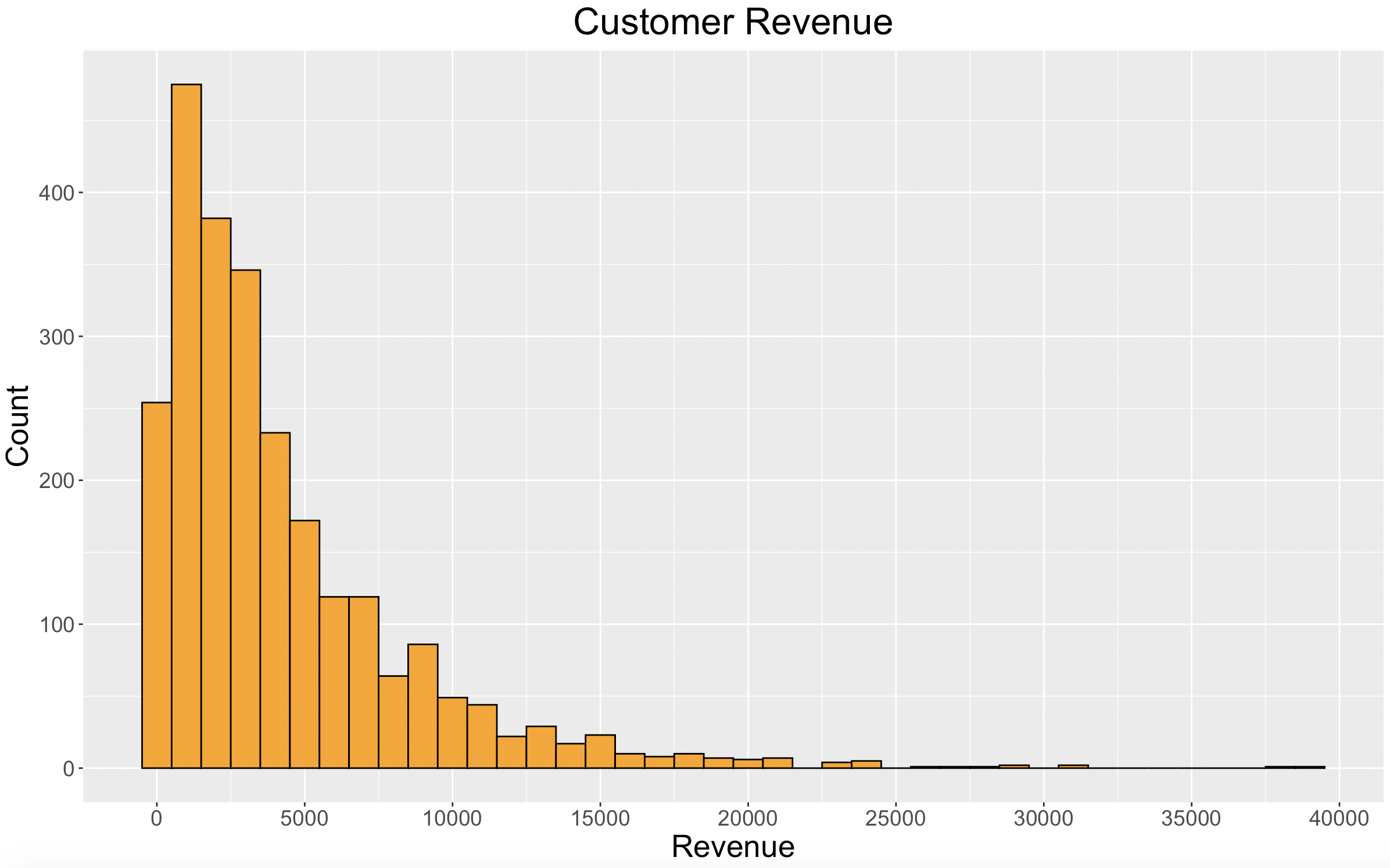
The distribution of customer revenue goes hand-in-hand with the distribution we saw in customer frequency.
Now for our “Value Score” using k-means.
# kmeans cluster into 4 groups
set.seed(1234)
revenue_k <- kmeans(revenue_table$Revenue, centers = 4)
revenue_table$Cluster <- revenue_k$cluster
revenue_table$Score <- ifelse(revenue_table$Cluster==3,1,
                              ifelse(revenue_table$Cluster==2,2,
                                     ifelse(revenue_table$Cluster==4,3,4)))
Now that we have scores established for each customer in regard to recency, frequency, and value, we can define our customer loyalty segments.
Customer Loyalty Segments
We want to combine what we’ve found with customer recency, frequency, and value to create customer loyalty segments.
The first step is to get all of our scores into one data frame.
# Customer Profiles
customer_profiles <- cbind(recency_table$household_key,
                           recency_table$Recency,
                           recency_table$Score,
                           frequency_table$Frequency,
                           frequency_table$Score,
                           revenue_table$Revenue,
                           revenue_table$Score)

customer_profiles <- as.data.frame(customer_profiles)

colnames(customer_profiles) <- c("household_key",
                                 "Recency",
                                 "RecencyCluster",
                                 "Frequency",
                                 "FrequencyCluster",
                                 "Revenue",
                                 "RevenueCluster")

customer_profiles$Recency <- as.numeric(as.character(customer_profiles$Recency))
customer_profiles$RecencyCluster <- as.numeric(as.character(customer_profiles$RecencyCluster))
customer_profiles$Frequency <- as.numeric(as.character(customer_profiles$Frequency))
customer_profiles$FrequencyCluster <- as.numeric(as.character(customer_profiles$FrequencyCluster))
customer_profiles$Revenue <- as.numeric(as.character(customer_profiles$Revenue))
customer_profiles$RevenueCluster <- as.numeric(as.character(customer_profiles$RevenueCluster))
Next, the Recency Score, Frequency Score, and Value Score will be summed together for each customer to create an “Overall Score.”
customer_profiles$OverallScore <- customer_profiles$RecencyCluster + customer_profiles$FrequencyCluster + customer_profiles$RevenueCluster
Each customer now has an Overall Score between 3 and 12. This will be used to define a customer as “High-Loyalty”, “Mid-Loyalty”, or “Low-Loyalty” as shown below.
- High-Loyalty: 9-12
- Mid-Loyalty: 6-8
- Low-Loyalty: 3-5
With these customer loyalty segments, we can look at a few different plots to see the relationship between the groups.
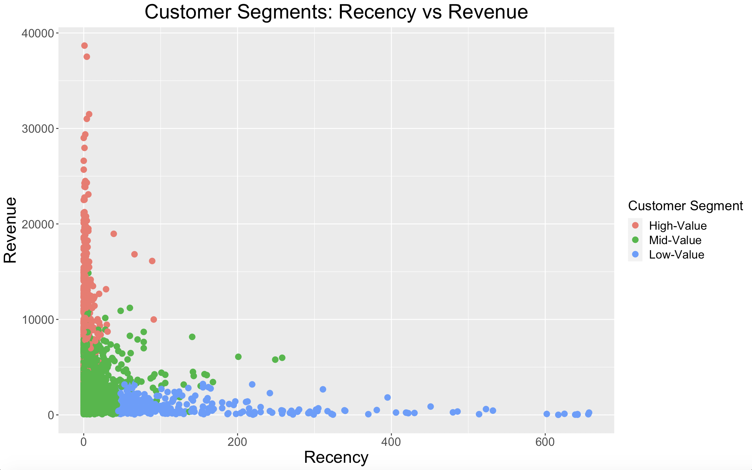
Our High-Loyalty customers have great recency numbers, while our Low-Loyalty customers have poor recency. As for our Mid-Loyalty customers, they look to have good recency, but they aren’t spending as much money as our High-Loyalty customers.
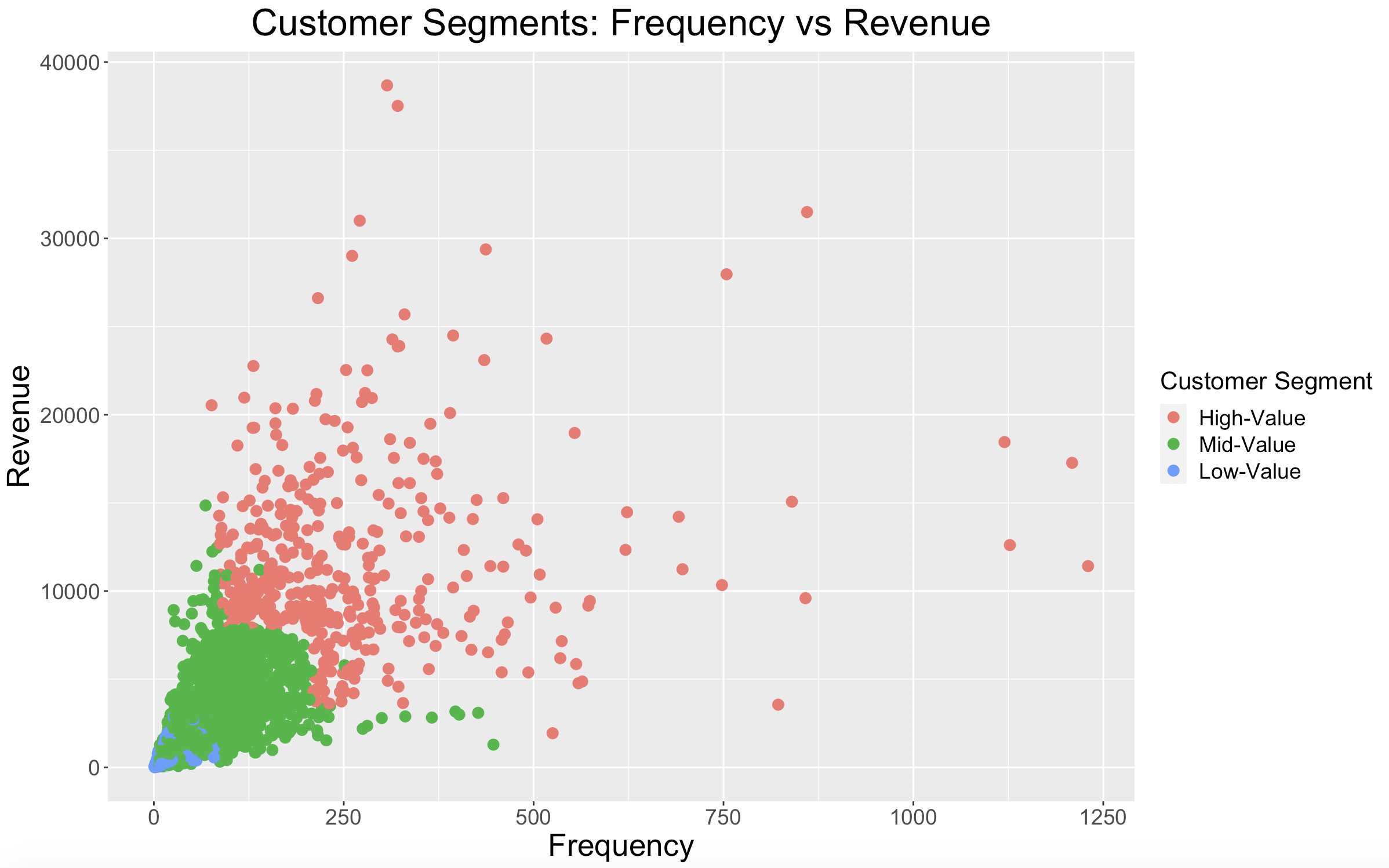
The plot shows what is expected: High-Loyalty customers shop most frequently, Mid-Loyalty customers a little less frequently, and Low-Loyalty customers least frequently. There is some overlap in frequency between our High-Loyalty and Mid-Loyalty customers, but again, our Mid-Loyalty customers just aren’t spending as much money.
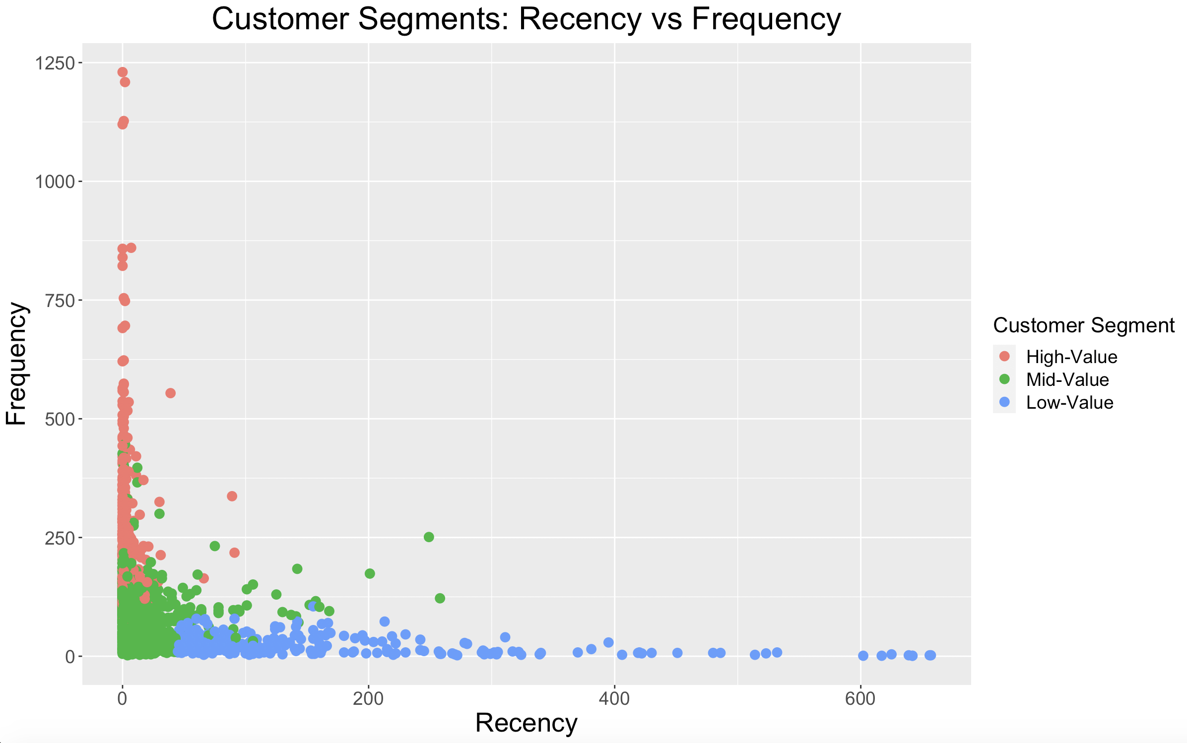
This plot shows that our customer loyalty segments are describing customers as intended. High-Loyalty customers shop frequently and recently, while Low-Loyalty customers do neither.
Takeaways
Just by looking at a few plots, we can already draw some solid conclusions on how to capitalize with each segment.
Here are my takeaways for each customer loyalty segment:
- High-Loyalty: these are our most loyal customers and bring in the most money, so it should be a priority to retain these customers.
- Mid-Loyalty: the recency and frequency are there, but it should be a priority to encourage these customers to spend more money per basket. Possibly sending them promotions on products in departments which they don’t normally shop.
- Low-Loyalty: the priority here is to improve both recency and frequency.
What’s Next?
The next step will be predicting Customer Lifetime Value. We will use transactional data as well as our customer loyalty segments to find which customers will be most valuable to our business going forward.