

dunnhumby Consumer Data: Exploratory Data Analysis
Introduction
The following analysis uses a publicly available dataset of household level transactional data from dunnhumby. dunnhumby is a customer data science company who works to “empower businesses everywhere to compete and thrive in the modern data-driven economy.” They are best known for their work with the Tesco Clubcard in the UK, and now Kroger’s loyalty card program in the US.
There are many opportunities that are presented with customer transactional data. We can look to identify customer segments, a customer’s lifetime value, customers at risk of taking their business elsewhere, future sales numbers, and more.
Identifying such patterns can be extremely beneficial to a business. Not only can this help a business plan into the future, but it provides valuable customer information that allows the company to target customers based entirely on their individual profiles.
Analysis
Before digging too deep into machine learning algorithms and building any models with the data, I want to do some data exploration to better understand the data that we will be working with.
Let’s load our packages and dataset.
You can download the datasets here.
library(caret)
library(dplyr)
library(ggplot2)
library(descr)
library(dummies)
library(Metrics)

transaction_data <- read.csv("transaction_data.csv", header = T)
The first thing I want to look at is the number of transactions per week to see if there were any patterns or abnormalities.
# plot transactions by week
ggplot(data=transaction_data, aes(x=WEEK_NO)) +
  geom_histogram(fill = "orange", color = "black", binwidth = 1) +
  scale_x_continuous(breaks = seq(0,102,10)) +
  labs(title = "Transactions per Week", x = "Week", y = "Transaction Count") +
  theme(plot.title = element_text(hjust = 0.5))
![]()
Its apparent that the data for weeks 1 through roughly 16 is much different than the rest of the data. Perhaps the data begins on a date where the store first opened, or the amount of transactional data collected slowly increased over the first 4 months of the dataset. Since the first 4 months of data is not consistent with the remainder of the dataset, I will exclude it from analyses going forward.
Revenue
At the end of the day, the performance of a business is all about how much money it makes. So, I want to explore revenue. (I wanted to look at profit, but since the dataset doesn’t include cost, revenue will do just fine.) First, I have to add a “REVENUE” column to the dataset which can be done by multiplying QUANTITY by SALES_VALUE for each transaction row.
# calculate revenue
transaction_data$REVENUE <- transaction_data$QUANTITY*transaction_data$SALES_VALUE
Now that revenue is included in the dataset, I want to look at the revenue of each week and see if everything passes the eye test. (Note that weeks 1-16 have been excluded.)
weekly_revenue <- transaction_data %>%
  group_by(WEEK_NO) %>%
  summarise(REVENUE = sum(REVENUE),
            CUSTOMERS = length(unique(household_key)),
            BASKETS = length(unique(BASKET_ID)))

# remove first 4 months
weekly_revenue <- weekly_revenue[-c(1:16),]

# weekly revenue plot
ggplot(data=weekly_revenue, aes(x=WEEK_NO, y=REVENUE)) +
  geom_line(stat="identity") +
  scale_x_continuous(breaks = seq(0,102,10)) +
  labs(title = "Revenue per Week", x = "Week", y = "Revenue") +
  theme(plot.title = element_text(hjust = 0.5))
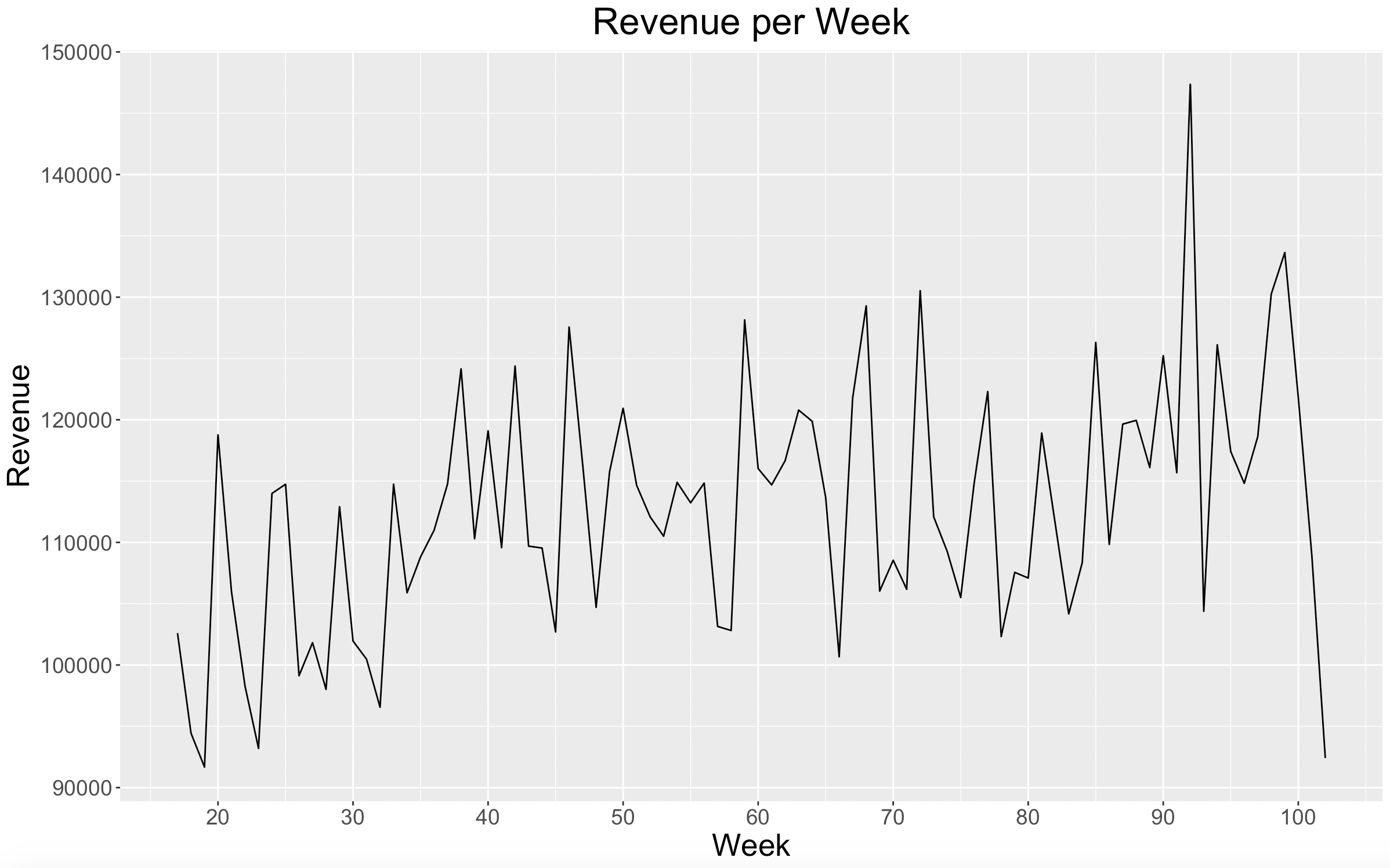
In the plot above, nothing seems to look out of the ordinary. There looks like there is a positive increase in revenue over time. We see a large spike in revenue during Week 92 which will be worth paying attention to as we go forward. There is also a large drop off with Week 102, but since it is the last week in the dataset, it is probably safe to assume that it is not a complete week of data.
Next, I want to look at the percent change in revenue from week to week.
# weekly revenue change
weekly_revenue <- weekly_revenue %>%
  mutate(PCT_CHANGE = (REVENUE/lag(REVENUE) - 1) * 100)

# weekly revenue pct change plot
ggplot(data=weekly_revenue, aes(x=WEEK_NO, y=PCT_CHANGE)) +
  geom_line(stat="identity") +
  geom_hline(yintercept = 0) +
  scale_x_continuous(breaks = seq(0,102,10)) +
  labs(title = "Revenue % Change per Week", x = "Week", y = "Revenue % Change") +
  theme(plot.title = element_text(hjust = 0.5))
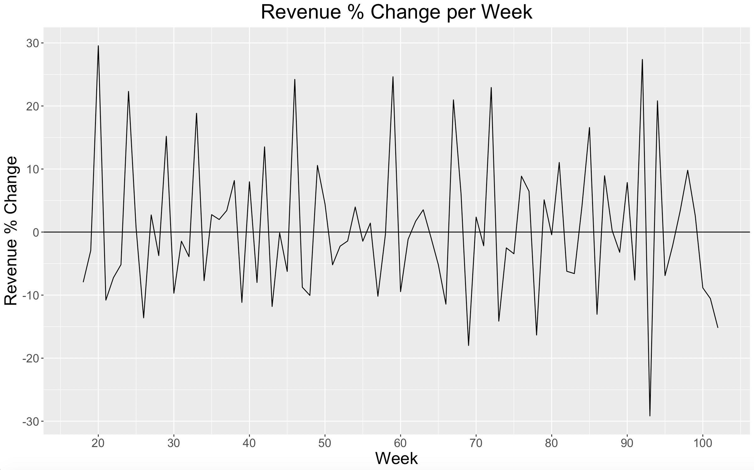
Again, everything appears stable and consistent. We can see here that in Week 92 revenue increased by over 27% which matches up to its large spike in the previous plot. Also because of Week 92’s large revenue spike, Week 93 has the largest decline in revenue percent change of any week.
Now I want to look at the number of customers per week.
# weekly customers plot
ggplot(data=weekly_revenue, aes(x=WEEK_NO, y=CUSTOMERS)) +
  geom_line(stat="identity") +
  scale_x_continuous(breaks = seq(0,102,10)) +
  labs(title = "Customers per Week", x = "Week", y = "Customers") +
  theme(plot.title = element_text(hjust = 0.5))
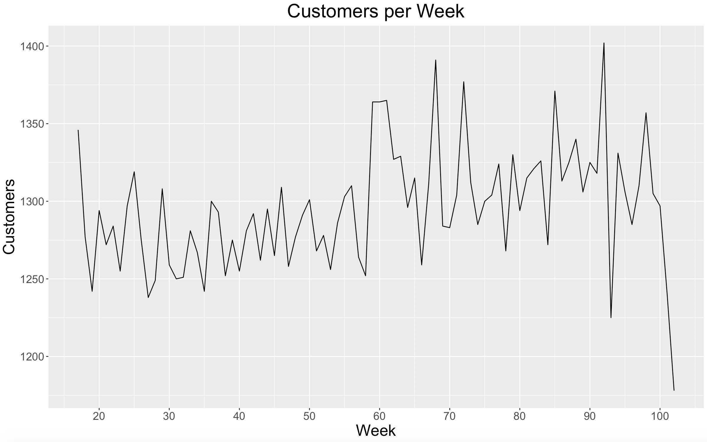
Similar to revenue, there looks to be a positive increase in the number of customers over time. Week 92 had the highest number of customers per week, lining up with its revenue spike. Week 93 had the lowest number of customers per week (not including Week 102), lining up with its large decline in revenue percent change. I hypothesize that Week 92 included some type of holiday that drove the huge spike in revenue and customers.
Next, let’s look at the average revenue per basket for each week.
weekly_revenue <- weekly_revenue %>%
  mutate(REVENUE_BASKET = REVENUE/BASKETS)

# weekly revenue per basket plot
ggplot(data=weekly_revenue, aes(x=WEEK_NO, y=REVENUE_BASKET)) +
  geom_line(stat="identity") +
  scale_x_continuous(breaks = seq(0,102,10)) +
  labs(title = "Basket Revenue per Week", x = "Week", y = "Revenue per Basket") +
  theme(plot.title = element_text(hjust = 0.5))
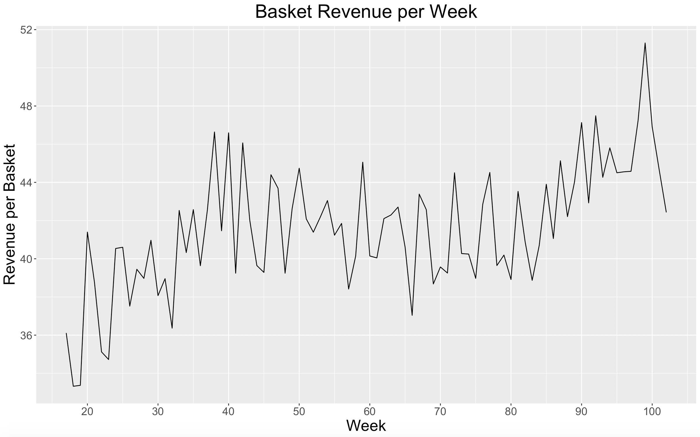
It is very clear here that the average revenue per basket increased over time.
After looking into revenue, we can see that 1) weekly revenue increased, 2) weekly customers increased, and 3) the average revenue of a basket increased over the timeframe of the dataset.
New Customers
Another valuable performance metric for a business is the number of new customers that are acquired. This particular dataset is described as “a group of 2,500 households who are frequent shoppers at a retailer,” so there may not be any valuable new customer insights here, but let’s take a look for ourselves.
# NEW CUSTOMERS
min_date <- transaction_data %>%
  group_by(household_key) %>%
  summarise(MinDate = min(WEEK_NO))

transaction_data <- left_join(transaction_data,
                              min_date,
                              by = "household_key")

transaction_data$NEW_CUSTOMER <- ifelse(transaction_data$MinDate==transaction_data$WEEK_NO, 1, 0)

new_vs_existing <- transaction_data %>%
  group_by(WEEK_NO,NEW_CUSTOMER) %>%
  summarise(REVENUE = sum(REVENUE),
            CUSTOMERS = length(unique(household_key)))

new_ratio <- transaction_data %>%
  group_by(WEEK_NO) %>%
  summarise(NEW_RATIO = length(unique(household_key[NEW_CUSTOMER==1]))/length(unique(household_key)))

ggplot(data=new_ratio, aes(x=WEEK_NO, y=NEW_RATIO)) +
  geom_bar(stat="identity") +
  scale_x_continuous(breaks = seq(0,102,10)) +
  labs(title = "New Customer Ratio per Week", x = "Week", y = "New Customer Ratio") +
  theme(plot.title = element_text(hjust = 0.5))
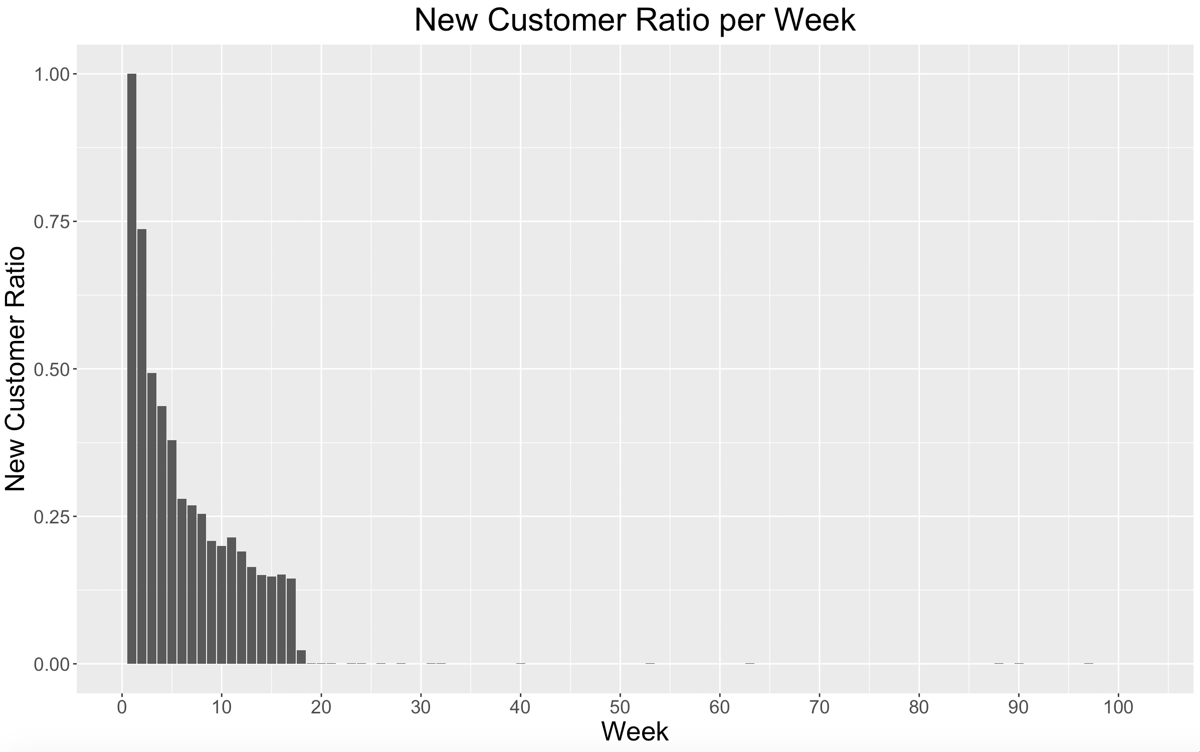
Here we see that after about 4 months (the data that we had previously excluded) there are very few new customers. Since this is a dataset of only frequent shoppers, there isn’t much to be done with new customer acquisition.
Retention
The final metric that I want to explore is retention. It is important for a business to know how many of its customers continue to come back and use their product or services. If retention numbers are low, then the business knows it needs to do something differently to get customers to return.
To do this, we need to look at the percent of customers each week that had also shopped at the retailer the previous week.
# RETENTION
weekly_customers <- transaction_data %>%
  group_by(WEEK_NO, household_key) %>%
  summarise(sum(REVENUE))

retention_matrix <- crosstab(weekly_customers$household_key, weekly_customers$WEEK_NO, dnn = c("household_key", "WEEK_NO"), plot = FALSE)

retention_table = data.frame()
for(i in 1:101){
  selected_week <- i+1
  prev_week <- i
  retention_data <- data.frame(matrix(data = NA, nrow = 1, ncol = 3))
  colnames(retention_data) <- c("WEEK_NO","TotalCustomers","RetainedCustomers")
  retention_data$WEEK_NO[1] <- selected_week
  retention_data$TotalCustomers[1] <- sum(retention_matrix$tab[,selected_week])
  retention_data$RetainedCustomers[1] <- sum(retention_matrix$tab[retention_matrix$tab[,selected_week]>0 & retention_matrix$tab[,prev_week]>0, selected_week])
  retention_table <- rbind(retention_table, retention_data)
}

retention_table$RetentionRate <- retention_table$RetainedCustomers/retention_table$TotalCustomers

# weekly retention rate
ggplot(data=retention_table, aes(x=WEEK_NO, y=RetentionRate)) +
  geom_line(stat="identity") +
  scale_x_continuous(breaks = seq(0,102,10)) +
  labs(title = "Retention per Week", x = "Week", y = "Retention") +
  theme(plot.title = element_text(hjust = 0.5))
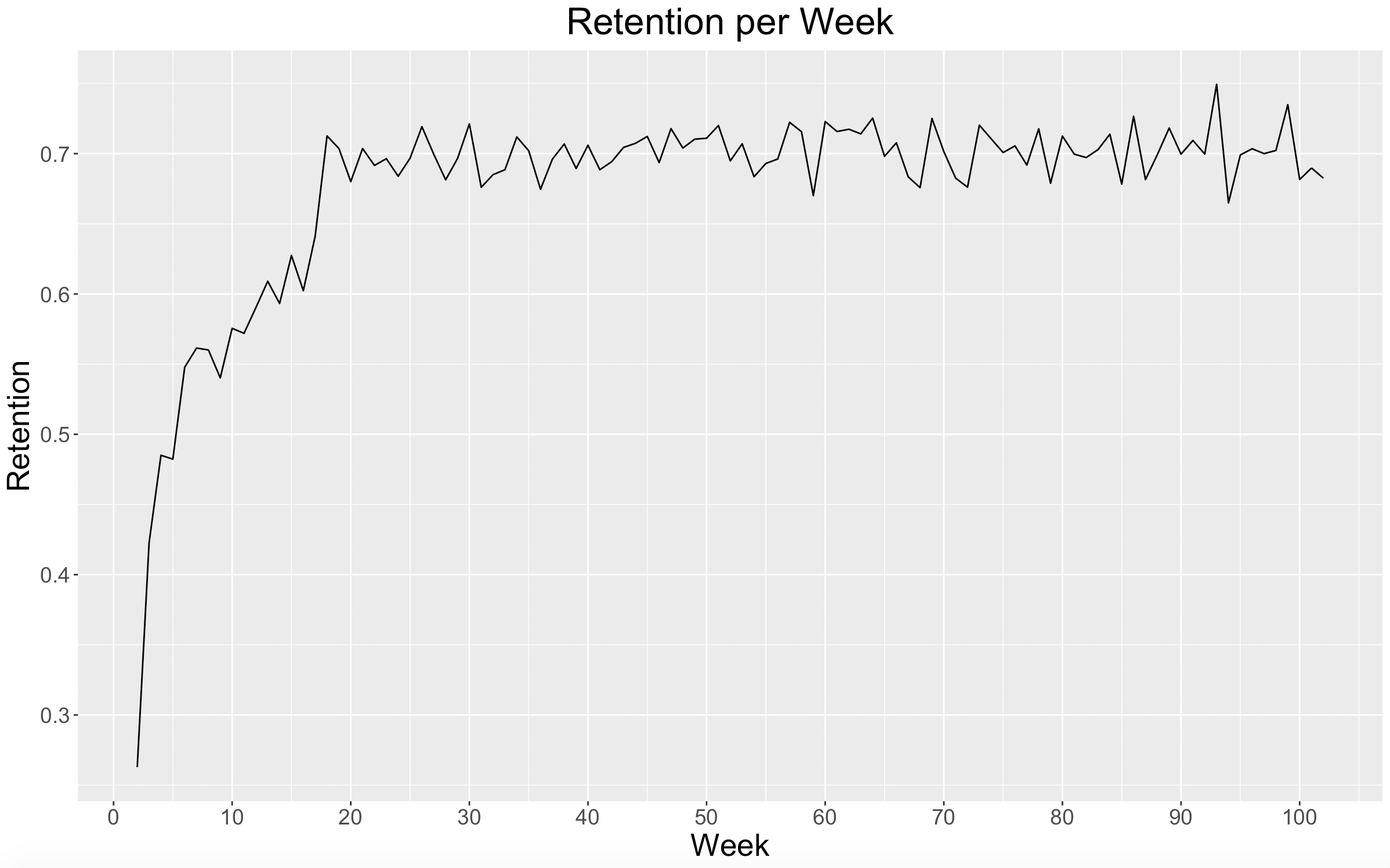
Here we can see that after the initial 4-month window, the retention rate was consistently around 70% for the remainder of the dataset. Since we know that this is a dataset comprised of frequent shoppers, it makes sense that we would see a good and steady retention rate amongst them.
Takeaways
Because this is a dataset of frequent shoppers, I found that there weren’t any useful insights when it came to new customer acquisition. I found that there was a steady retention rate around 70%, but this is also most likely driven by the fact that the data only reflects frequent shoppers.
Over the timeframe of the dataset, I found that weekly revenue increased, the average revenue per basket increased, and the number of weekly customers increased.
Here are my 3 main takeaways:
- Frequent customers are being retained.
- Frequent customers are spending more.
- Frequent customers are shopping more frequently.
What’s Next?
The next step will be Customer Segmentation. We will use the dataset to group our frequent customers into similar customer segments.